ScratchJr Connect
Compiling curated ScratchJr teaching materials for parents and educators
Duration
Sep 2019 - May 2021 (1 yr, 8 mo)
Client
DevTech Research Group
Team
6 web developers (2-3 at any given time), 1 UX designer, 1 researcher
Skills
Wordpress Plugins and Themes, Wireframing, Figma, Think Aloud, Usability Testing, HTML/CSS, Javascript, PHP
Overview
As a project manager, UX designer, and web developer, I led the end-to-end UX design and development of a Wordpress site for educators and parents to share resources related to teaching ScratchJr.
In addition to defining the layout of site features, I led the process of building them into a live website. I adapted Wordpress plugins for custom features, prioritized tasks for a team of 3-5 developers, and met frequently with tech support to troubleshoot bugs.
In May 2021, we launched the live site at scratchjrconnect.tufts.edu/. It now hosts 1300+ registered users, and 100+ approved resources that are free to the public!
Challenge
How might we allow educators to access DevTech-approved teaching materials related to ScratchJr?
I took on this project as an independent study, hoping to apply UX design skills I was learning on my own. I picked up on previously conducted UX research by Hyejin Im and Eddie Futterman. I initially used these prior insights to rework the site’s UI design and determine its tech stack.
My Goal
Launch a functional website that allows users to submit resources pertaining to ScratchJr, which is an educational app that helps young children gain literacy in coding. The website needed to be scalable to serve possibly millions of existing educators who teach using ScratchJr in their classrooms or at home.

Why It Matters
For years, ScratchJr users have reported a need for teaching materials recommended by a verified source. Devtech Research Group is one of few authorities on ScratchJr best teaching practices, and has not had a central platform for making these recommendations. Providing such a platform would reduce the work time that ScratchJr representatives spend manually addressing individual requests, while minimizing frustration for educators who normally have to track down a perfect lesson plan on their own.
Outcome
Search, filter, and bookmark lessons vetted by ScratchJr experts
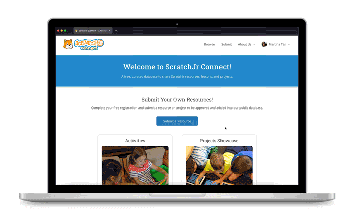
Easily Browse resources from all over the world, and download them for free. Create an account in order to Submit your own files with domain-specific metadata, such as the school subjects and learning criteria that your resource targets. This metadata makes it easy to filter resources by tags.
User Analysis
Educators want to enrich their child’s use of ScratchJr with minimal effort
A typical ScratchJr educator
Occupation
Teacher or parent
Age Range
24 years or older
User Abilities
New to using and teaching with ScratchJr; familiar with navigating the web
User Goals
- Easily and quickly find an effective lesson plan to edit, then implement, when using ScratchJr with their kids.
- Share their own projects & resources with others.
- Get inspired for the next time they teach with ScratchJr.
Competitive Analysis
Filling a unique niche that other sharing platforms cannot
I assessed other online platforms that serve similar functions for our users, in order to gain design inspiration, as well as to understand how ScratchJr Connect could stand out.
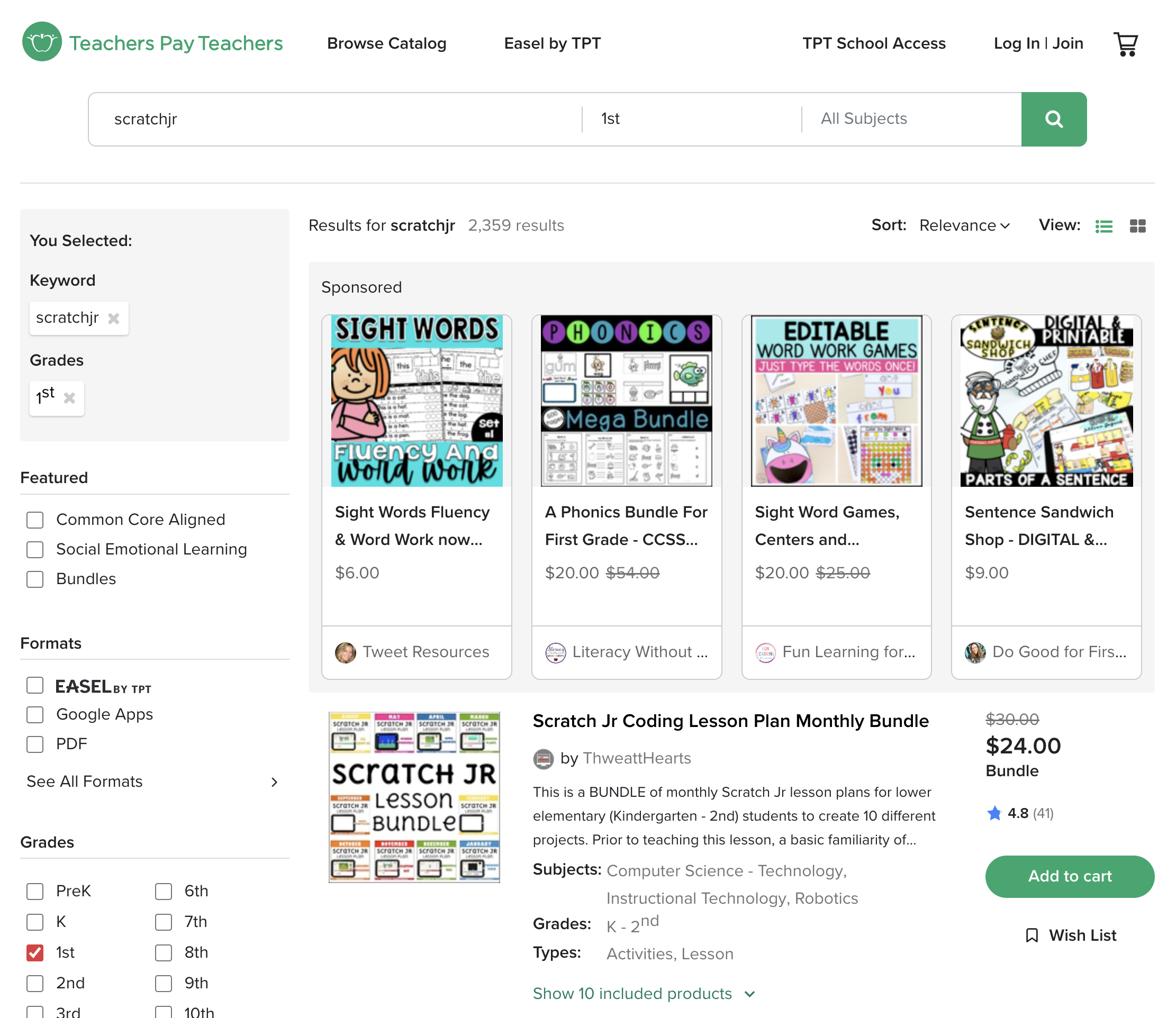
e.g. Teachers Pay Teachers
Strengths: Ability to filter by many categories; rating and reviewing by established member profiles
Weaknesses: Resources are not free; site is not specifically for coding materials for kids
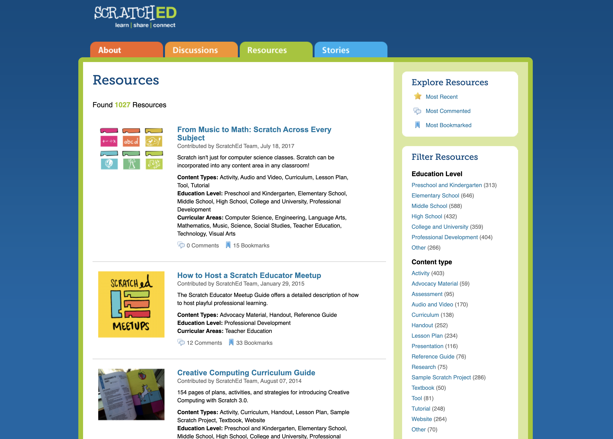
e.g. ScratchED
Strengths: Online community for Scratch educators; discussion boards; bookmarking
Weaknesses: Geared towards Scratch, not ScratchJr; threads get long and hard to skim
A Reinforced Design Direction: Reviewing products, both related and unrelated to ScratchJr, helped me discover why certain features did or didn't work. Eventually, through prototype testing and discussions with my supervisors, I narrowed in on the site's core features.
Task Analysis
Mapping site visitors’ wants and needs to site features
With support from previous project members’ research, I prioritized the core requirements of our platform based on its primary use cases. It was useful to map goals to features in order to make the purpose of everything I would design clearer.
| Primary User Goal | Corresponding Feature |
|---|---|
| Find materials for a specific grade level, subject, type of resource, etc. | Tagging System and Filtered Search by Tags |
| Post a lesson plan that I want others to see and use | Submission Form with File Upload and Custom Details |
| Assess how credible the website is | Well-written About Page |
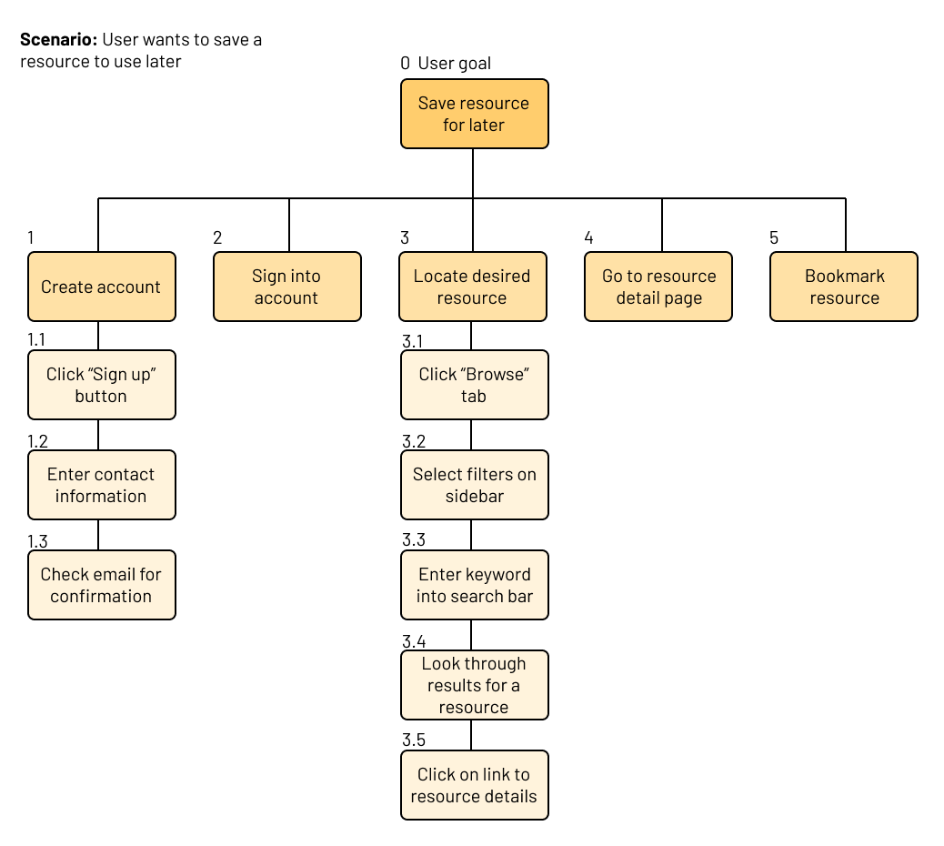
I also broke down the steps to achieve these goals in a hierarchical task analysis. By identifying the steps it takes a user to achieve each goal, I could focus my design process on the flows most essential to users.
Wireframing
Communicating my design vision to non-designers
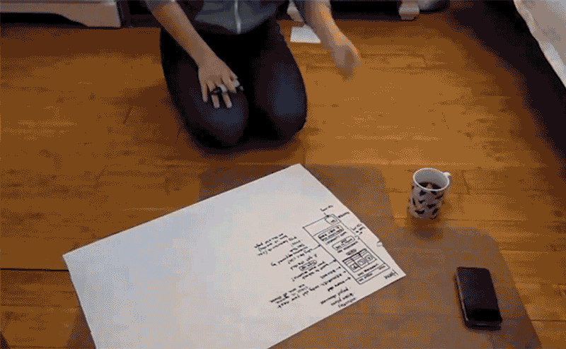
After initially focusing on building the product vision and design, I was responsible for hiring and training developers who could help implement that. Although our team had dabbled in Figma prototyping at the start, I quickly realized that I wanted to convey my ideas faster than I could mock them up in high fidelity. I returned to pen and paper to make sketches of key screens that we had not covered in previous prototypes.
High-fi Prototyping
Conducting think-aloud testing with target users
I conducted Think-Aloud tests with 5 individuals with backgrounds in K-12 education. Through these interviews, I uncovered usability issues and additional feature requests by asking participants to Browse and Submit resources via our Figma prototype.
“Imagine yourself as a pre-kindergarten teacher having little to no experience in using ScratchJr, and now you have to start using ScratchJr in your classroom. You have been recommended a website called ScratchJr Connect [...] Show me how you would navigate this site to get a copy of a curriculum that teaches math with ScratchJr."
—The start scenario from our Think Aloud protocol
What we learned from 5 usability tests
- High-level categories for resources were overcomplicated: Although generative research suggested we should sort resources into 5 categories, users reported confusion about the distinction between "Lessons" and "Activity Plans". This fueled later discussions where we finally settled on just two categories, “Activities” and “Project Showcase”.
- Educators want to verify the science behind ScratchJr: Users wanted to learn more about the “PTD Rating” out of five stars that every resource received from Devtech. This pushed us to provide clarity in how we displayed this rating—a five-star system wasn’t sufficient.
- Internet speed greatly affects user adoption: One participant pointed out that most schools have slow wi-fi, making every successive page-load a hindrance to successful submission. We decided to spread the Submit process across fewer pages, to prevent users giving up halfway through.
Look & Feel
Getting detailed with UI specifications
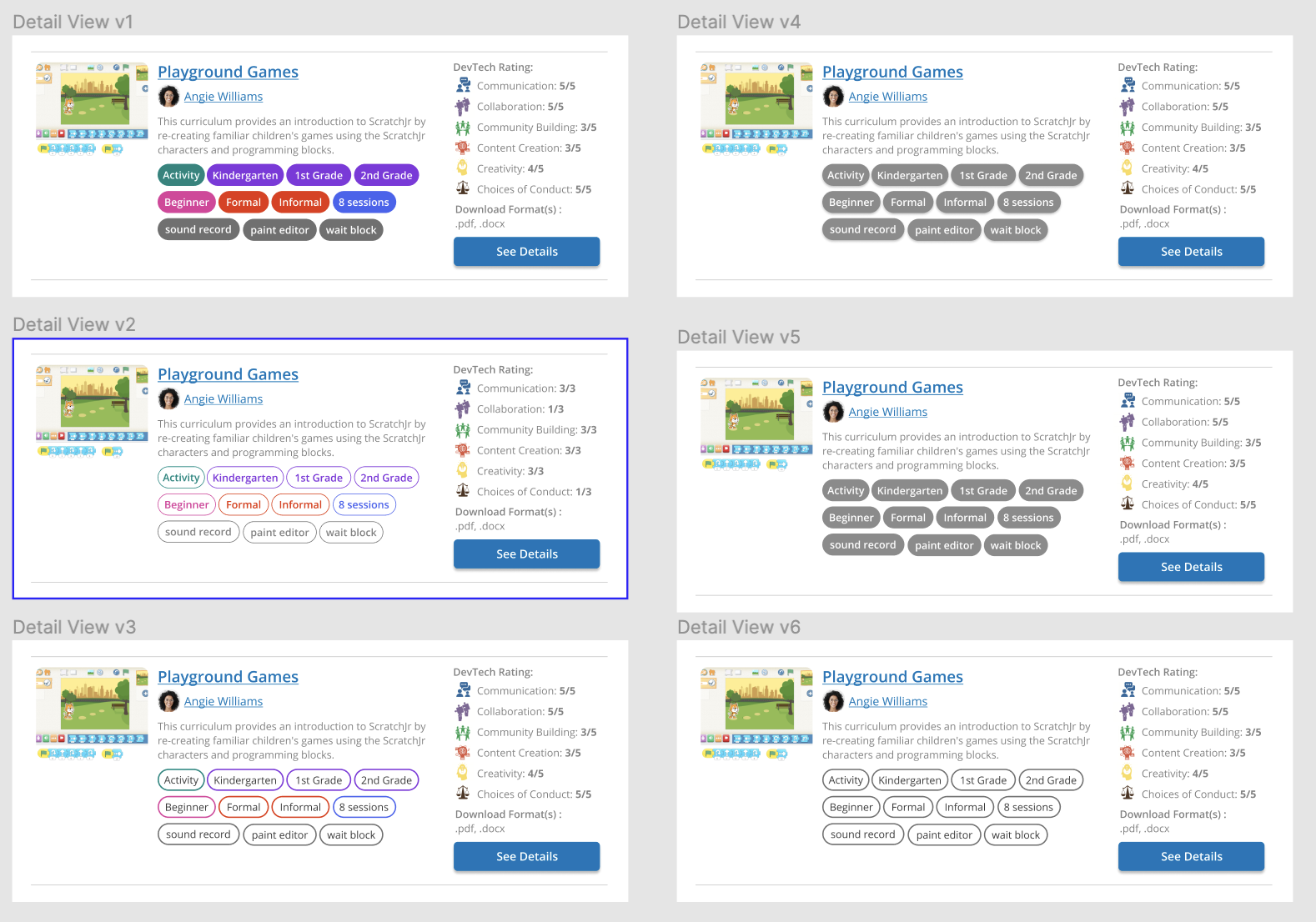
Based on learning from our usability testing, I created high-fidelity mockups of the ScratchJr Connect entries that would be a key focus in the browsing experience. This addressed insight from educators, introducing a revamped information hierarchy which spoke to the tags and granular DevTech rating that testers were the most curious about. I tried many combinations of color and contrast to see for myself how visual styling contributed to the playful nature of the website while remaining informative at a glance and not too overwhelming.
Reflection
Fail fast—it builds character!
I learned firsthand the drawbacks of jumping too quickly into Figma. Although we uncovered a lot from think-alouds with a high-functioning prototype, it was heartbreaking to implement major insights from our research and completely scrap the screens we had spent weeks on. I've now learned to test sketchy wireframes before moving onto higher fidelity prototypes.
This need for speed extends to our testing process. Now that I swear by affinity diagramming, I would re-do this project with a scrappy mindset so I could feel more empowered to routinely speak with more users.