TEMS Shift Tracker
Centralizing schedule management for a roster of Emergency Medical Technicians
Duration
Feb - Apr 2019 (3 mo)
My Role
UI Design Lead, UX Researcher
Team
3 researchers/designers — Sam Chung, Timothy Holt, Anthony Tranduc
Skills
Task Analysis, Wireframing, Think Aloud Testing, Paper Prototyping, Clickthrough Prototypes
Overview
Tufts Emergency Medical Services (TEMS) provides first response to medical incidents on campus. The Emergency Medical Technicians (EMTs) on this team are hard-working students who volunteer their time and expertise to man the TEMS ambulance at all hours of the day.
My team and I introduced a new mobile app that would allow TEMS volunteers to communicate easily with their manager and fellow EMTs about getting their shifts covered. By iteratively prototyping with increasing fidelity and testing usability with target users, I created a polished mockup that provides streamlined focus for a young, but easily fatigued, audience.
Outcome
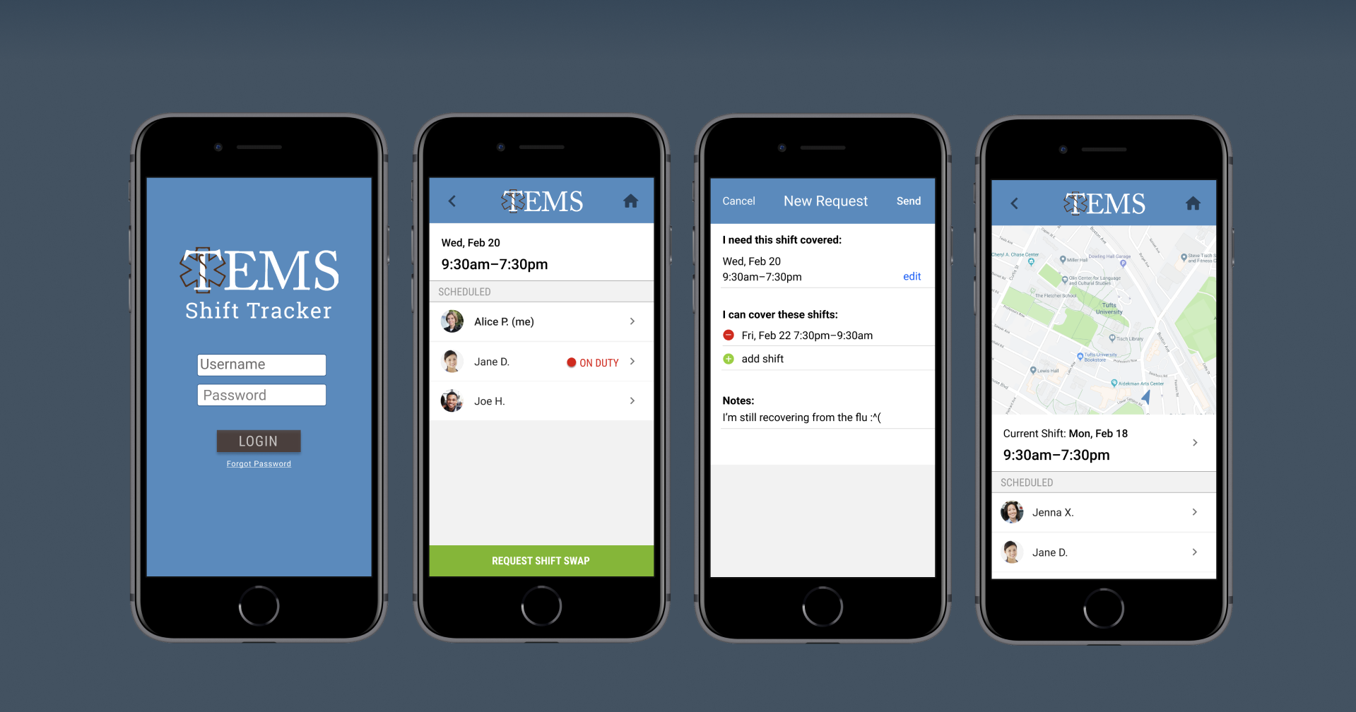
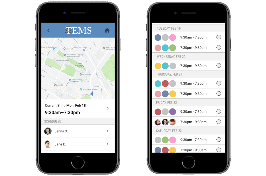
Manage shift requests during class and on your commute!
The final TEMS Shift Tracker is a mobile solution for more organized and focused scheduling. Bespoke features for creating and editing shift requests allow you to involve exactly the right people in real time. The map view shows you who's on duty now, helping harried student EMTs quickly locate the ambulance for smoother shift changes.
User and Task Analysis
Breaking down the task of getting a volunteer shift covered
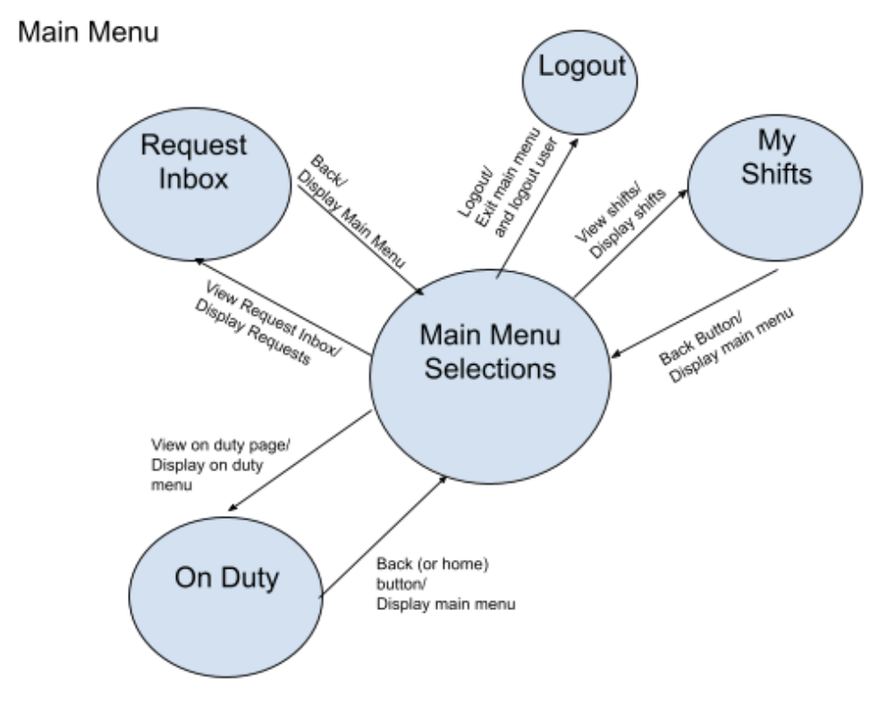
With the goal of building out a functional prototype to improve the volunteer experience for campus EMTs, we decided early on to pursue a mobile app based on preliminary interviews with TEMS volunteers. We identified an opportunity to utilize a mobile design after we learned that our users tend to approach this task—of getting shift coverage—while on the go.
Before so much as drawing a screen, we spent ample time planning out our system at a high-level, using simple diagrams to model interactions. Drawing from linguistic theories, we created a "syntactic level specification" of actions and pages in our system. This helped us think of specific UI features in terms of a cohesive "language" of interactions.
Learning from an industry veteran: Our instructor was a pioneer in HCI research as early as the 1990s! Therefore, it shouldn't be a surprise that a method like the above is highly technical and perhaps unwieldy in modern agile design environments. I'm not sure if I'll be diagramming syntactic level models anytime soon, although it was great to gain exposure to classic HCI theory. Thanks anyway, Professor Jacob.
Wireframing
Capturing the user journey through sketching
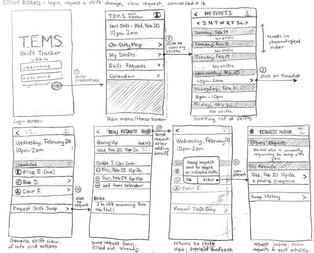
Once we had a handle on the language we would be using across our app, I could then translate that into UI wireframes. I started by thinking of key user tasks as "journeys", and translated these journeys into "storyboard" sequences of screens that could help them complete the task. Because of our initial work mapping feature requirements to user goals, I felt like I had a clear picture of what these screens could look like.
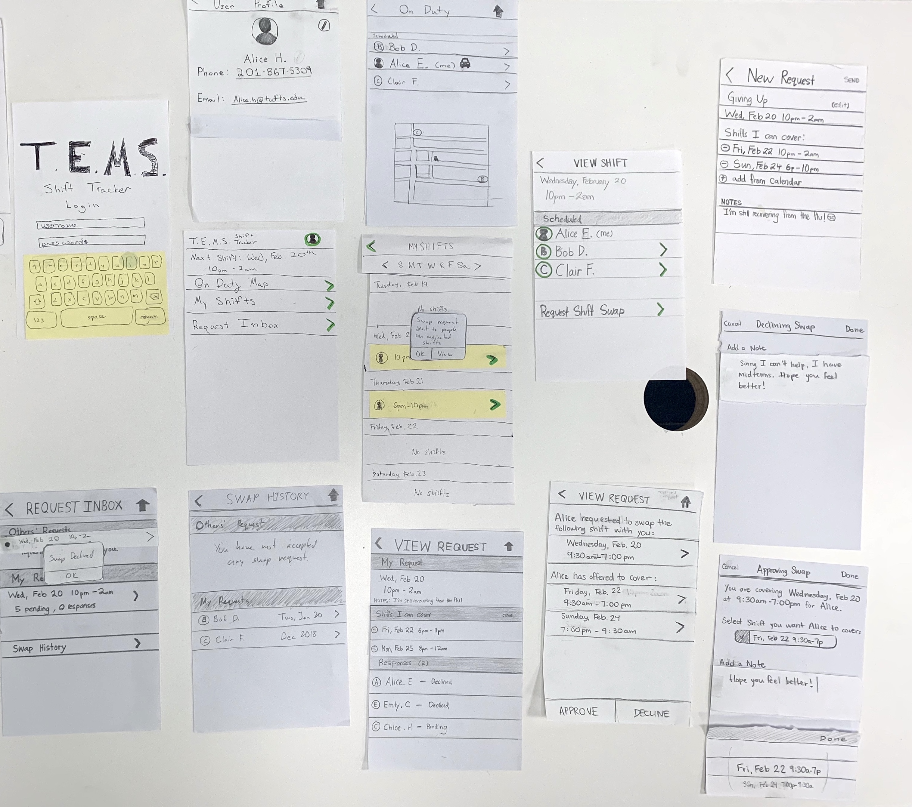
Paper Prototyping
Bringing interactions to life (as cheaply as possible)
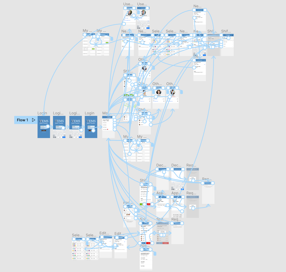
To help testing facilitators understand the capabilities of our paper prototype system, I made a user flow diagram. This provided a visualization of all the screens a user would click through to complete particular tasks. The user flow diagram served as thorough documentation for operating our paper prototype, so that all members of our team knew, given a user interaction, how the screen should change.
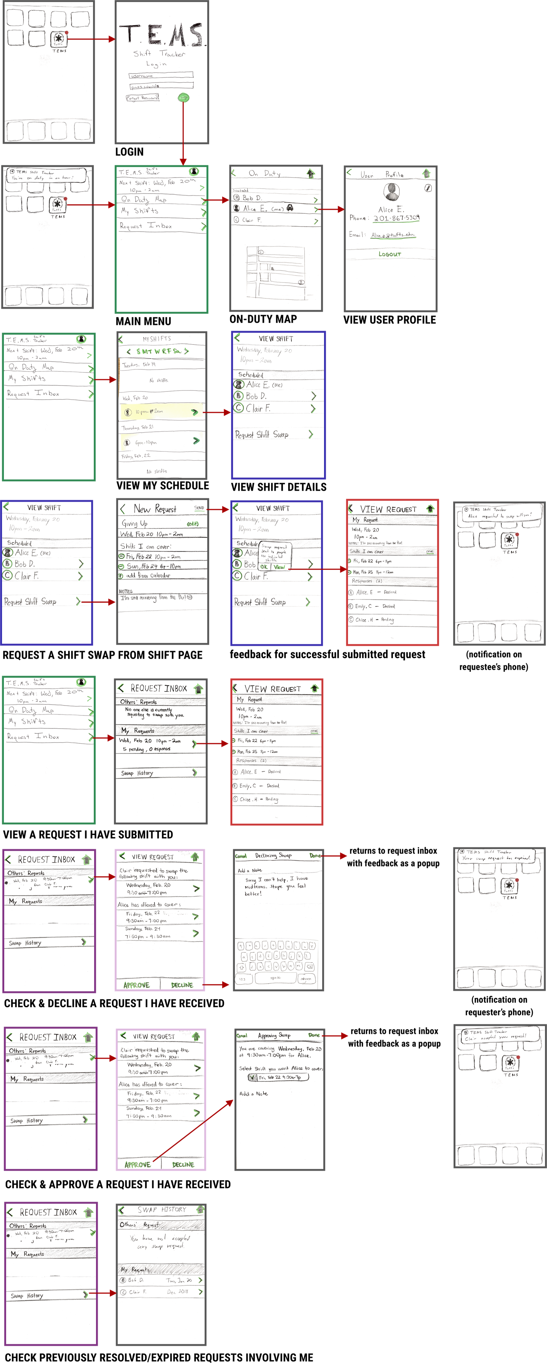
The paper prototype was a quick—and honestly, fun—way of testing our concepts with users. When we introduced the paper prototype to test participants, we provided them with a short explanation of the app's purpose and a set of tasks to complete while Thinking Aloud.
From this initial user testing, we caught minor imperfections that we could address in future designs, and certainly would be costly if spotted later. Our test participants pointed out that:
- We had neglected to add a consistent "Home" button across all screens.
- There was no way to Edit the user's pending request once submitted.
- It would be helpful to see which shifts on the calendar are Pending a swap.
- The term "Request Inbox" did not match their mental model for a repository of incoming and outgoing shift swap requests.
Having verified that most of our design made sense to EMT interviewees, we discussed how we would address the above feedback and soon began prototyping in Figma.
High-fi Prototyping
Making interactions pixel-perfect
We built the remainder of our iterations in Figma, allowing for higher visual fidelity and clickthrough interactivity. At such a high level of realism, I noticed that users could power through our listed tasks with relative ease and speed. However, the downside of a polished Figma prototype was apparent in cases of large volumes of interactive or customized data, such as user's position on a map or the full list of shifts.
By testing our Figma prototype with another round of participants, we continued to refine the visual design system and simplify the information architecture of the app. It was rewarding to reach a point of certainty about the high-level design, while making improvements to make our product even more intuitive.
Final Thoughts
The design always changes
This was my first formal educational foray into human-computer interaction. As such, it was considerably guided and procedural. Still, I learned the reality of selectively incorporating user feedback—although not every suggestion from test participants led to a change in the UI, it was invaluable to hear the good and the bad from target users.